The colour green on weather maps does not indicate that temperatures are “positive” for the season
¿Qué se ha dicho? A map that predicts the evolution of the heat wave for …
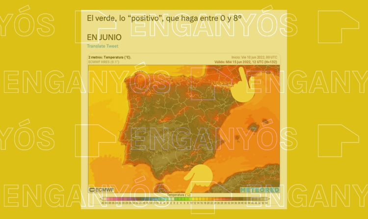
¿Qué se ha dicho?
A map that predicts the evolution of the heat wave for next Wednesday, June 15, considers “positive” temperatures between 0 and 8 ºC during the month of June.
¿Qué sabemos?
The temperatures that mark the map correspond to the predictions for June 15, but the interpretation that is made of the color with which they are marked is erroneous. It is a code that does not mark what is “positive” or “negative” for the time, as the author suggests, nor does it vary with the seasons or geographical location. Colors simply mark a temperature range.
The recent heat wave is generating numerous climate disinformation claims. One of them has been especially viral, clocking more than 1,000 retweets and 4,300 likes on Twitter. In it, one user criticises a map of temperatures in which the values between 0 and 8ºC correspond to the colour green. The account has interpreted this relationship as a “positive” assessment made by the creators of the map regarding what the temperatures should be in June, but it is a MISLEADING inference.
The map and the legend of temperatures are true, but their interpretation is not. The selected colours of the map depend on the absolute value of the temperatures, and are not based on whether they are “positive” or “negative”, as the user suggests. In other words, the map is not making an assessment of the temperatures, but is simply assigning a colour to a temperature that is expected for a region and a specific moment.
The green, the “positive”, forecast between 0 and 8º IN JUNE
Presently, many climate disinformation claims have to do with the extraordinary heat wave that started this past Sunday, 12 June, and that will last until at least next Friday, 17 June, according to Spain’s National Weather Agency (Agencia Estatal de Meteorología, AEMAT).
One of these posts was shared more than a thousand times and has 4,300 likes on Twitter. In the post, a user added a link to a map from the Meteored weather website with a forecast for 15 May, criticising that the values between 0 and 8ºC, marked green on the map, should be considered something “positive” in June.
However, the analysis is misleading because the colours chosen by the weather website are not related to an assessment made by meteorologists about the temperatures they show.
The legend uses a standard, non-evaluative colour palette which is the same all year round: “You don’t adapt the map for each season of the year, or for each specific day, you make a colour scale that can be adapted for any season of the year”, Juan José González, chief meteorologist at Aemet, explains to Verificat.
Ramon Pascual, head of the Prediction and Surveillance group of the Territorial Delegation of the Aemat in Catalonia, agrees with González, explaining to Verificat that “the hot colours, such as orange, red and grey, show high temperatures, and the cold colours such as green and blue, are the ones used for low temperatures”.
The weather maps that appear on the meteorology websites, such as this one from Meteored, are made automatically, i.e. they are “painted” in line with the data gathered from different observatories and models. The different websites process these numbers and draw the predictive maps based on a colour scale that allows them to do this “translation” automatically.
More frequent heat waves due to climate change
One of the effects of climate change is precisely the increase of extreme weather phenomena, among them more intense, frequent and/or longer heatwaves (page 4 of the report by the Intergovernmental Panel on Climate Change, o IPCC). The frequency of this type of event has increased significantly in recent years. As we already explained in this article, heat waves are meteorological phenomena involving temperatures that remain much higher than expected on those dates for more than three consecutive days.
Alongside the appearance of these extreme phenomena, disinformation messages on social media that generate noise and confusion about the causes and consequences of said climate events are also proliferating. Some of them state that sea temperatures are freezing, or that the surface area of ice in the poles is expanding, while others, such as this one which we already analysed, flat-out deny the existence of climate change.